Test
Testdata : Array
Usedata to specify the data that you want to display on the table.
This prop is required and you should give it an array
// with es6
const data = [ ... ];
//...
<BootstrapTable data={ data }>
//...
</BootstrapTable>
keyField : String
UsekeyField to tell table which column is unique. This is same as isKey in <TableHeaderColumn>
Tips: react-bootstrap-table support data manipulation(CRUD) so that we need to fetch correct row by a unique column.
<BootstrapTable data={ data } keyField='account'>
  <TableHeaderColumn dataField='account'>Account</TableHeaderColumn>
  <TableHeaderColumn dataField='name'>Name</TableHeaderColumn>
</BootstrapTable>
As mentioned, following is equivalent
<BootstrapTable data={ data }>
  <TableHeaderColumn isKey dataField='account'>Account</TableHeaderColumn>
  <TableHeaderColumn dataField='name'>Name</TableHeaderColumn>
</BootstrapTable>
remote : String | Function
react-bootstrap-table default handle the data changing(like sorting, filtering insert or pagination etc) in a data store, call TableDataStore.
So this prop is false by default, if you enable remote, which means you need to handle the all data manipulation on your application(flux implement or something like that).
Therefore, react-bootstrap-table support following event hooks so that you can interact to your server or local store with the data changing
onSortChangeonSearchChangeonPageChangeonSizePerPageListonAddRowonDeleteRowonExportToCSVonFilterChangeonCellEdit
- sort
- pagination
- cellEdit
- insertRow
- dropRow
- filter
- search
- exportCSV
remote(remoteObj) {
    // Only cell editing, insert and delete row will be handled by remote store
    remoteObj.cellEdit = true;
    remoteObj.insertRow = true;
    remoteObj.dropRow = true;
    return remoteObj;
  }
// ...
<BootstrapTable data={ data }>
  <TableHeaderColumn isKey dataField='account'>Account</TableHeaderColumn>
  <TableHeaderColumn dataField='name'>Name</TableHeaderColumn>
</BootstrapTable>
To use remote pagination properly you need to pass fetchInfo property.You can check this example a whole example, and also these all are the useful examples to learn how to programming with
remote mode.
height : String
Useheight to adjust the height of table. You need give a string with an unit(px) value like following:
Tips: react-bootstrap-table display all the data without fixed header, because height is auto by default. If you give a height, the header will fixed when data is too long.
<BootstrapTable data={ data } height='120px'>
//...
</BootstrapTable>
maxHeight : String
UsemaxHeight to set the maximum height of table. You need give a string with an unit(px) value like height:
<BootstrapTable data={ data } maxHeight='120px'>
//...
</BootstrapTable>
striped : Bool
Same as the Bootstrap table class: .table-striped, default is false. You can enable this feature by the following example:
<BootstrapTable data={ data } striped>
//...
</BootstrapTable>
hover : Bool
Same as the Bootstrap table class: .table-hover, default is false. You can enable this feature by the following example:
<BootstrapTable data={ data } hover>
//...
</BootstrapTable>
condensed : Bool
Same as the Bootstrap table class: .table-condensed, default is false. You can enable this feature by the following example:
<BootstrapTable data={ data } condensed>
//...
</BootstrapTable>
bordered : Bool
Similar like Bootstrap table class: .table-bordered, default is true. You can disable this feature by the following example:
<BootstrapTable data={ data } bordered={ false }>
//...
</BootstrapTable>
pagination : Bool
Enable pagination by settingpagination to true, default is false.
Default pagination have a dropdown for choosing size per page and a pages list with next and previous page button
<BootstrapTable data={ data } pagination >
//...
</BootstrapTable>
Following is the default pagination view:

trClassName : String | Function
Assign the class name of row(tr). This attribute accept a string or callback function. However, a callback function have more ability to customize. If a string given, means this string value will be presented as the row class. If a function given, will passrow and rowIndex as arguments and should return a string for the presenting class. for examples:
trClassFormat(row, rowIndex) {
  // row is the current row data
  return rowIndex % 2 === 0 ? "tr-odd" : "tr-even";  // return class name.
}

render() {
  return (
    <BootstrapTable data={ data } trClassName={ this.trClassFormat }>
      //...
    </BootstrapTable>
  );
}
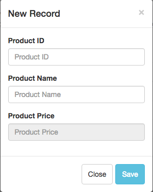
insertRow : Bool
Enable the row insertion by settinginsertRow to true, default is false.
react-bootstrap-table support a row insert feature by a pop modal.
If you enable row insertion, there's a  button on the upper left side of table.
<BootstrapTable data={ data } insertRow >
//...
</BootstrapTable>
Following is the pop modal for row insertion:
deleteRow : Bool
Enable the row insertion by settingdeleteRow to true, default is false.
react-bootstrap-table support a row deletion feature but you need to enable the row selection by selectRow
.Because react-bootstrap-table will drop rows the according to the selected row by user select.
If you enable row dropping, there's a  button on the upper left side of table.
render() {
  const selectRow = {
    mode: 'radio' //radio or checkbox
  };
  return (
    <BootstrapTable
      data={ data }
      selectRow={ selectRow }
      deleteRow>
      //...
    </BootstrapTable>
  );
}
columnFilter : Bool
Enable column filter by setting columnFilter to true, default is false. It's a very simple filter functionality supported byreact-bootstrap-table
If enabled, there're input text fields per column under the table, user can input your filter condition by each column.
However, react-bootstrap-table have a better column filter which have multiple filter type. You can check this
<BootstrapTable data={ data } columnFilter >
//...
</BootstrapTable>
search : Bool
Enable search functionality by settingsearch to true, default is false.
If enabled, there is a input field on the upper left side of the table and user can type their search text on it.
<BootstrapTable data={ data } search >
//...
</BootstrapTable>
searchPlaceholder : String
UsesearchPlaceholder to change the placeholder in search field, default is Search
<BootstrapTable
  data={ data }
  search
  searchPlaceholder='input something...' >
    //...
</BootstrapTable>
multiColumnSearch : Bool
Enable multi search bymultiColumnSearch, default is false.
If you want to use multi search, you must enable search at first.
Tips: Use space to delimited search text. EX: 3 4, which means match all 3 or 4 datas in table.
<BootstrapTable
  data={ data }
  search
  multiColumnSearch>
    //...
</BootstrapTable>
exportCSV : Bool
Enable export csv functionality by settingexportCSV as true, default is false.
If you enable, there's a  button on the upper left side of table.
<BootstrapTable
  data={ data }
  exportCSV>
    //...
</BootstrapTable>
csvFileName : String | Function
Set the CSV filename (e.g. items.csv). Default is spreadsheet.csv. If a function given, you should return a file name as a string type.
<BootstrapTable
  data={ data }
  exportCSV
  csvFileName='table-export'>
    //...
</BootstrapTable>
ignoreSinglePage : Bool
Give true will ignore the pagination if only one page, default is false.
<BootstrapTable
  data={ data }
  pagination
  ignoreSinglePage>
  //...
</BootstrapTable>
scrollTop : String | Number
Specify a fix position for the vertical bar if it exist. Available is a number orTop and Bottom
<BootstrapTable
  data={ data }
  scrollTop={ 'Bottom' }>
  //...
</BootstrapTable>
containerStyle : Object
Add your own styles object to thereact-bs-table-container class
<BootstrapTable
  data={ data }
  containerStyle={ { background: '#00ff00' } }>
    //...
</BootstrapTable>
tableStyle : Object
Add your own styles object to thereact-bs-table class
<BootstrapTable
  data={ data }
  tableStyle={ { background: '#00ff00' } }>
    //...
</BootstrapTable>
headerStyle : Object
Add your own styles object to thereact-bs-container-header class
<BootstrapTable
  data={ data }
  headerStyle={ { background: '#00ff00' } }>
    //...
</BootstrapTable>
bodyStyle : Object
Add your own styles object to thereact-bs-container-body class
<BootstrapTable
  data={ data }
  bodyStyle={ { background: '#00ff00' } }>
    //...
</BootstrapTable>
containerClass : String
Add your own class names on thereact-bs-table-container class
<BootstrapTable
  data={ data }
  containerClass='my-custom-class'>
    //...
</BootstrapTable>
tableContainerClass : String
Add your own class names on thereact-bs-table class
<BootstrapTable
  data={ data }
  tableContainerClass='my-custom-class'>
    //...
</BootstrapTable>
headerContainerClass : String
Add your own class names on thereact-bs-container-header class
<BootstrapTable
  data={ data }
  headerContainerClass='my-custom-class'>
    //...
</BootstrapTable>
bodyContainerClass : String
Add your own class names on thereact-bs-container-body class
<BootstrapTable
  data={ data }
  bodyContainerClass='my-custom-class'>
    //...
</BootstrapTable>
tableHeaderClass : String
react-bootstrap-table separate two table element as header and body. So the
tableHeaderClass is for the table element in the header.
<BootstrapTable
  data={ data }
  tableHeaderClass='my-custom-class'>
    //...
</BootstrapTable>
tableBodyClass : String
react-bootstrap-table separate two table element as header and body. So the
tableBodyClass is for the table element in the body.
<BootstrapTable
  data={ data }
  tableBodyClass='my-custom-class'>
    //...
</BootstrapTable>
multiColumnSort : Number
Enable the multi sort on table and the number value is means max sorting volumn.
<BootstrapTable
  data={ data }
  multiColumnSort={ 2 }>
    //...
</BootstrapTable>
fetchInfo : Object
react-bootstrap-table support the remote pagination feature, when you enable this feature,
react-bootstrap-table will check fetchInfo to generate pagination.
fetchInfo accept an object which have the following props:
render() {
  const fetchInfo = {
    dataTotalSize: 100 // or checkbox
  };
  return(
    <BootstrapTable
      data={ data }
      remote={ true }
      pagination={ true }
      fetchInfo={ fetchInfo }>
      //...
    </BootstrapTable>
  );
}
fetchInfo: dataTotalSize : Number
You can assign total size of remote stored data.
render() {
  const fetchInfo = {
    dataTotalSize: 100
  };
  return(
    <BootstrapTable
      data={ data }
      remote={ true }
      pagination={ true }
      fetchInfo={ fetchInfo}>
      //...
    </BootstrapTable>
  );
}
selectRow : Object
react-bootstrap-table support the row selection feature, when you enable this feature,
react-bootstrap-table will add a selection column at first position.
selectRow accept an object which have the following props:
- mode
- clickToSelect
- clickToSelectAndEditCell
- clickToExpand
- bgColor
- columnWidth
- className
- selected
- unselectable
- hideSelectColumn
- showOnlySelected
- onSelect
- onSelectAll
- customComponent
selectRow, you should tell react-bootstrap-table which the mode you wanted.
Following is a most simple example for configuring the selectRow
render() {
  const selectRow = {
    mode: 'radio' // or checkbox
  };
  return(
    <BootstrapTable
      data={ data }
      selectRow={ selectRow }>
      //...
    </BootstrapTable>
  );
}
selectRow: mode : String
Specifing the row selection for single(radio) or multiple(checkbox). Ifradio assigned, there's a radio button in the selection column; likewise, the checkbox is same.
render() {
  const selectRow = {
    mode: 'radio'  // single select
  };
  return(
    <BootstrapTable
      data={ data }
      selectRow={ selectRow }>
      //...
    </BootstrapTable>
  );
}
render() {
  const selectRow = {
    mode: 'checkbox'  // multi select
  };
  return(
    <BootstrapTable
      data={ data }
      selectRow={ selectRow }>
      //...
    </BootstrapTable>
  );
}
selectRow: clickToSelect : Bool
If true, click the row will trigger selection on that row and also trigger cell editing if you enabled cell edit. Default is false. This feature is very useful that user dont move their mouse on the radio button or checkbox, they can just click on the row to select it.
render() {
  const selectRow = {
    mode: 'checkbox',  // multi select
    clickToSelect: true
  };
  return(
    <BootstrapTable
      data={ data }
      selectRow={ selectRow }>
      //...
    </BootstrapTable>
  );
}
selectRow: clickToSelectAndEditCell : Bool
If true, click the row will trigger selection and cell editing if you enabled cell edit. Default is false.
render() {
  const selectRow = {
    mode: 'checkbox',  // multi select
    clickToSelectAndEditCell: true
  };
  return(
    <BootstrapTable
      data={ data }
      selectRow={ selectRow }>
      //...
    </BootstrapTable>
  );
}
selectRow: clickToExpand : Bool
Default is false, it will trigger expanding row also if true assigned.
isExpandableRow(row) {
  if (row.id < 2) return true;
    else return false;
}

expandComponent(row) {
  return (
    ...
  );
}
render() {
  const selectRow = {
    mode: 'checkbox',
    clickToExpand: true   // Trigger expand and selection together
  };
  return(
    <BootstrapTable
      data={ data }
      expandableRow={ this.isExpandableRow }
      expandComponent={ this.expandComponent }
      selectRow={ selectRow }>
      //...
    </BootstrapTable>
  );
}
selectRow: bgColor : Bool | Function
You can assign the background color of row which be selected. If your requirement is much complex, you can assign a function tobgColor,
you will have more ability to custom rows background color when selecting.
render() {
  const selectRow = {
    mode: 'checkbox',  // multi select
    bgColor: '#fefefe'
  };
  return(
    <BootstrapTable
      data={ data }
      selectRow={ selectRow }>
      //...
    </BootstrapTable>
  );
}
render() {
  const selectRow = {
    mode: 'checkbox',  // multi select
    bgColor: function(row, isSelect) {
      if (isSelect) {
        const { id } = row;
        if (id < 2) return 'blue';
        else if (id < 4) return 'red';
        else return 'yellow';
      }
      return null;
    }
  };
  return(
    <BootstrapTable
      data={ data }
      selectRow={ selectRow }>
      //...
    </BootstrapTable>
  );
}
selectRow: columnWidth : String
You can change the width of the selection column bycolumnWidth.
render() {
  const selectRow = {
    mode: 'checkbox',  // multi select
    columnWidth: '60px'
  };
  return(
    <BootstrapTable
      data={ data }
      selectRow={ selectRow }>
      //...
    </BootstrapTable>
  );
}
selectRow: className : String
You can assign the class name of row which be selected.
render() {
  const selectRow = {
    mode: 'checkbox',  // multi select
    className: 'custom-select-class'
  };
  return(
    <BootstrapTable
      data={ data }
      selectRow={ selectRow }>
      //...
    </BootstrapTable>
  );
}
selectRow: selected : Array
Give an array data to perform which rows you want to be selected when table loading. The content of array should be the rowkeys which you want to be selected.
render() {
  const selectRow = {
    mode: 'checkbox',  // multi select
    selected: [ 'row1', 'row3' ]
  };
  return(
    <BootstrapTable
      data={ data }
      selectRow={ selectRow }>
      //...
    </BootstrapTable>
  );
}
selectRow: unselectable : Array
Give an array data to perform which rows you hope not to be selected. The content of array should be the rowkeys.
render() {
  const selectRow = {
    mode: 'checkbox',  // multi select
    unselectable: [ 'row4', 'row5' ]
  };
  return(
    <BootstrapTable
      data={ data }
      selectRow={ selectRow }>
      //...
    </BootstrapTable>
  );
}
selectRow: hideSelectColumn : Bool
Default is false. If true, the radio/checkbox column will be hide. You can enable this attribute if you enable clickToSelect and you don't want to show the selection column.
render() {
  const selectRow = {
    mode: 'checkbox',  // multi select
    hideSelectColumn: true
  };
  return(
    <BootstrapTable
      data={ data }
      selectRow={ selectRow }>
      //...
    </BootstrapTable>
  );
}
selectRow: showOnlySelected : Bool
Default is false. If enabled, there will be a button on top of table for toggling selected rows only.
render() {
  const selectRow = {
    mode: 'checkbox',  // multi select
    showOnlySelected: true
  };
  return(
    <BootstrapTable
      data={ data }
      selectRow={ selectRow }>
      //...
    </BootstrapTable>
  );
}
selectRow: onSelect : Function
Accept a custom callback function, if a row be selected or unselected, this function will be called. This callback function taking three arguments:- row
- isSelected
- event
row is the row data which you wanted to select or unselect.isSelectedis a boolean value which means "whether or not that row will be selected?".eventis the event target object.Tips: If the return value of this function is
false,
the select or deselect action will not be applied.
handleRowSelect(row, isSelected, e) {
  // ...
}

render() {
  const selectRow = {
    mode: 'checkbox',  // multi select
    onSelect: this.handleRowSelect
  };
  return(
    <BootstrapTable
      data={ data }
      selectRow={ selectRow }>
      //...
    </BootstrapTable>
  );
}
selectRow: onSelectAll : Function
Accept a custom callback function, if click select all checkbox, this function will be called. This callback function taking two arguments:- isSelected
- rows
isSelectedis a boolean value which means "whether or not that row will be selected?".rows is the rows which be selected or unselected.Tips:
If return value of this function is false, the select all or deselect all action will not be applied.
If return value of this function is an array of rowkeys, this array will be applied as selection row when select all trigger.
It's useful when you have a validation to filter some rows on selecting all.
handleRowSelect(isSelected, rows) {
  // ...
}

render() {
  const selectRow = {
    mode: 'checkbox',  // multi select
    onSelectAll: this.handleSelectAll
  };
  return(
    <BootstrapTable
      data={ data }
      selectRow={ selectRow }>
        //...
    </BootstrapTable>
  );
}
selectRow: customComponent : Function
ThoughcustomComponent, you can custom your own selection checkbox or radio button. This function take one argument: props
and have following properties:
- type
- checked
- disabled
- onChange
- rowIndex
You can follow this example to learn how ot customize the selection column
cellEdit : Object
react-bootstrap-table support the cell editing feature, when you enable this feature,
react-bootstrap-table will make the target cell as editable by clicking or dbclicking.
cellEdit accept an object which have the following props:
Be carefully, when you enable cellEdit, you should tell react-bootstrap-table which the mode you wanted.
Following is a most simple example for configuring the cellEdit
render() {
  const cellEdit = {
    mode: 'click' // click cell to edit
  };
  return(
    <BootstrapTable
      data={ data }
      cellEdit={ cellEdit }>
      //...
    </BootstrapTable>
  );
}
cellEdit: mode : String
Spectify the condition that will trigger cell editing.(click or dbclick)
render() {
  const cellEdit = {
    mode: 'click' // click cell to edit
  };
  return(
    <BootstrapTable
      data={ data }
      cellEdit={ cellEdit }>
      //...
    </BootstrapTable>
  );
}
render() {
  const cellEdit = {
    mode: 'dbclick' // double click cell to edit
  };
  return(
    <BootstrapTable
      data={ data }
      cellEdit={ cellEdit }>
      //...
    </BootstrapTable>
  );
}
cellEdit: blurToSave : Bool
EnableblurToSave will trigger a saving event on cell when mouse blur on the input field. Default is false.
In the default condition, you need to press ENTER to save the cell.
render() {
  const cellEdit = {
    mode: 'click', // click cell to edit
    blurToSave: true,
  };
  return(
    <BootstrapTable
      data={ data }
      cellEdit={ cellEdit }>
      //...
    </BootstrapTable>
  );
}
cellEdit: nonEditableRows : Function
nonEditableRows tell react-bootstrap-table which rows should not be edited on all of the columns. Briefly, its a row level limitation
Please assign a callback function, and this function is supposed to be return an array of row keys.
render() {
  const cellEdit = {
    mode: 'click', // click cell to edit
    nonEditableRows: : function() {
      // if product id less than 3, will cause the whole row noneditable
      // this function should return an array of row keys
      return products.filter(p => p.id < 3).map(p => p.id);
    }
  };
  return(
    <BootstrapTable
      data={ data }
      cellEdit={ cellEdit }>
     //...
    </BootstrapTable>
  );
}
cellEdit: beforeSaveCell : Function
Accept a callback function, before cell saving, this function will be called. This callback function taking three arguments:- row
- cellName
- cellValue
beforeSaveCell(row, cellName, cellValue) {
  // if you dont want to save this editing, just return false to cancel it.
}

render() {
  const cellEdit = {
    mode: 'click', // click cell to edit
    beforeSaveCell: this.beforeSaveCell,
  };
  return(
    <BootstrapTable
      data={ data }
      cellEdit={ cellEdit }>
     //...
    </BootstrapTable>
  );
}
cellEdit: afterSaveCell : Function
Accept a custom callback function, after saving cell, this function will be called. This callback function taking three arguments:- row
- cellName
- cellValue
afterSaveCell(row, cellName, cellValue) {
  // do your stuff...
}

render() {
  const cellEdit = {
    mode: 'click', // click cell to edit
    afterSaveCell: this.afterSaveCell,
  };
  return(
    <BootstrapTable
      data={ data }
      cellEdit={ cellEdit }>
      //...
    </BootstrapTable>
  );
}
options : Object
react-bootstrap-table support a lotf of feature, you can configure some options for table.
options accept an object which have the following props:| Sort | Search | Pagination | Expanding Row | Customization | Others |
|---|---|---|---|---|---|
|
sortName : String
Manage the sort field by yourself. You can also control the sort order by sortOrder
constructor(props) {
  super(props);
  // Manage the sort state in your application
  this.state = {
    sortName: undefined,
    sortOrder: undefined
  };
  this.onSortChange = this.onSortChange.bind(this);
}

onSortChange(sortName, sortOrder) {
  this.setState({
    sortName,
    sortOrder
  });
}

render() {
  const options = {
    sortName: this.state.sortName,
    sortOrder: this.state.sortOrder,
    onSortChange: this.onSortChange
  };
  return (
    <BootstrapTable data={ products } options={ options }>
      <TableHeaderColumn dataField='id' isKey={ true } dataSort={ true }>Product ID</TableHeaderColumn>
      <TableHeaderColumn dataField='name' dataSort={ true }>Product Name</TableHeaderColumn>
      <TableHeaderColumn dataField='price'>Product Price</TableHeaderColumn>
    </BootstrapTable>
  );
}
sortOrder : String
Manage the sort order by yourself. It's same as sortName. Tips: The available value isdesc and asc.
defaultSortName : String
Assign a default sort field.
render() {
  const options = {
    defaultSortName: 'name'
  };
  return (
    <BootstrapTable data={ products } options={ options }>
      <TableHeaderColumn dataField='id' isKey={ true }>Product ID</TableHeaderColumn>
      <TableHeaderColumn dataField='name' dataSort={ true }>Product Name</TableHeaderColumn>
      <TableHeaderColumn dataField='price'>Product Price</TableHeaderColumn>
    </BootstrapTable>
  );
}
defaultSortOrder : String
Assign a default sort order. Tips: The available value isdesc and asc.
render() {
  const options = {
    defaultSortName: 'name',
    defaultSortOrder: 'asc'
  };
  return (
    <BootstrapTable data={ products } options={ options }>
      <TableHeaderColumn dataField='id' isKey={ true }>Product ID</TableHeaderColumn>
      <TableHeaderColumn dataField='name' dataSort={ true }>Product Name</TableHeaderColumn>
      <TableHeaderColumn dataField='price'>Product Price</TableHeaderColumn>
    </BootstrapTable>
  );
}
sortIndicator : Bool
False to disable sort indicator on header column, default is true.
render() {
  const options = {
    sortIndicator: false
  };
  return (
    <BootstrapTable data={ products } options={ options }>
      <TableHeaderColumn dataField='id' isKey={ true }>Product ID</TableHeaderColumn>
      <TableHeaderColumn dataField='name'>Product Name</TableHeaderColumn>
      <TableHeaderColumn dataField='price'>Product Price</TableHeaderColumn>
    </BootstrapTable>
  );
}
onSortChange : Function
Assign a callback function which will be called after trigger sorting. This function taking two argument:sortNamesortOrder
onSortChange = (sortName, sortOrder) => {
  // ...
}
render() {
  const options = {
    onSortChange: this.onSortChange
  };
  return (
    <BootstrapTable data={ products } options={ options }>
      <TableHeaderColumn dataField='id' isKey={ true }>Product ID</TableHeaderColumn>
      <TableHeaderColumn dataField='name' dataSort>Product Name</TableHeaderColumn>
      <TableHeaderColumn dataField='price' dataSort>Product Price</TableHeaderColumn>
    </BootstrapTable>
  );
}
noDataText : String | JSX
Change the displaying text on table if data is empty. This option accept a value of string or JSX.
render() {
  const options = {
    noDataText: 'Empty Table'
  };
  return (
    <BootstrapTable data={ products } options={ options }>
      <TableHeaderColumn dataField='id' isKey={ true }>Product ID</TableHeaderColumn>
      <TableHeaderColumn dataField='name'>Product Name</TableHeaderColumn>
      <TableHeaderColumn dataField='price'>Product Price</TableHeaderColumn>
    </BootstrapTable>
  );
}
withoutNoDataText : Bool
Show/Hide the on data text if table if empty, default is false.
render() {
  const options = {
    withoutNoDataText: true
  };
  return (
    <BootstrapTable data={ products } options={ options }>
      // ...
    </BootstrapTable>
  );
}
defaultSearch : String
Setting the default search condition.
render() {
  const options = {
    defaultSearch: 'Product 1'
  };
  return (
    <BootstrapTable data={ products } options={ options } search>
      // ...
    </BootstrapTable>
  );
}
searchDelayTime : Number(millisecond)
A delay for triggering search after a keyup event
render() {
  const options = {
    searchDelayTime: 1500
  };
  return (
    <BootstrapTable data={ products } options={ options }>
      <TableHeaderColumn dataField='id' isKey={ true }>Product ID</TableHeaderColumn>
      <TableHeaderColumn dataField='name'>Product Name</TableHeaderColumn>
      <TableHeaderColumn dataField='price'>Product Price</TableHeaderColumn>
    </BootstrapTable>
  );
}
ignoreEditable : Bool
Default is false, if true means you want to ignore anyeditable on <TableHeaderColumn> when row insert.
render() {
  const options = {
    ignoreEditable: true
  };
  return (
    <BootstrapTable data={ products } options={ options } insertRow>
      <TableHeaderColumn dataField='id' isKey={ true }>Product ID</TableHeaderColumn>
      <TableHeaderColumn dataField='name'>Product Name</TableHeaderColumn>
      <TableHeaderColumn dataField='price'>Product Price</TableHeaderColumn>
    </BootstrapTable>
  );
}
clearSearch : Bool
Only work when search enabled. If true, there will be a button beside search input field for clearing search field text.
render() {
  const options = {
    clearSearch: true
  };
  return (
    <BootstrapTable data={ products } options={ options } search>
      // ...
    </BootstrapTable>
  );
}
onSearchChange : Function
Assign a callback function which will be called when search text change. This function taking three argument:searchTextcolInfosmultiColumnSearch
searchText.
This function almost used on remote, you can check
this example.
onSearchChange = (searchText, colInfos, multiColumnSearch) => {
  //...
}

render() {
  const options = {
    onSearchChange: this.onSearchChange
  };
  return (
    <BootstrapTable data={ products } options={ options } search>
      // ...
    </BootstrapTable>
  );
}
afterSearch : Function
Assign a callback function which will be called after trigger searching. This function taking two argument:searchTextresult
afterSearch = (searchText, result) => {
  //...
}

render() {
  const options = {
    afterSearch: this.afterSearch
  };
  return (
    <BootstrapTable data={ products } options={ options } search>
      // ...
    </BootstrapTable>
  );
}
afterTableComplete : Function
Assign a callback function which will be called after table update.
handleTableComplete() {
  // ...
}

render() {
  const options = {
    afterTableComplete: this.handleTableComplete
  };
  return (
    <BootstrapTable data={ products } options={ options }>
      <TableHeaderColumn dataField='id' isKey={ true }>Product ID</TableHeaderColumn>
      <TableHeaderColumn dataField='name'>Product Name</TableHeaderColumn>
      <TableHeaderColumn dataField='price'>Product Price</TableHeaderColumn>
    </BootstrapTable>
  );
}
afterDeleteRow : Function
Assign a callback function which will be called after row delete. This function taking one argument:rowKeys, which means the row keys you dropped.
handleDeletedRow(rowKeys) {
  // ...
}

render() {
  const options = {
    afterDeleteRow: this.handleDeletedRow
  };
  const selectRow = {
    mode: 'checkbox',
    clickToSelect: true
  };
  return (
    <BootstrapTable
      data={ products }
      selectRow={ selectRow }
      options={ options }
      deleteRow>
      <TableHeaderColumn dataField='id' isKey={ true }>Product ID</TableHeaderColumn>
      <TableHeaderColumn dataField='name'>Product Name</TableHeaderColumn>
      <TableHeaderColumn dataField='price'>Product Price</TableHeaderColumn>
    </BootstrapTable>
  );
}
afterInsertRow : Function
Assign a callback function which will be called after row insert. This function taking one argument:row, which means the row object you added.
handleInsertedRow(row) {
  // ...
}

render() {
  const options = {
    afterInsertRow: this.handleInsertedRow
  };
  return (
    <BootstrapTable
      data={ products }
      options={ options }
      insertRow>
      // ...
    </BootstrapTable>
  );
}
afterColumnFilter : Function
Assign a callback function which will be called after trigger column filtering. This function taking two argument:filterCondsresult
filterConds: It's an array object which contain all column filter conditions.
result: The results after filtering.
This function only work when you enable columnFilter on <BootstrapTable> or
define the filter on <TableHeaderColumn>
afterColumnFilter(filterConds, result) {
  console.log('Filter Conditions: ');
  for (const prop in filterConds) {
    console.log('Filter column= ' + prop + ', Filter value= ' + filterConds[prop]);
  }
  console.log('Result is:');
  for (let i = 0; i < result.length; i++) {
    console.log('Product: ' + result[i].id + ', ' + result[i].name + ', ' + result[i].price);
  }
}

render() {
  const options = {
    afterColumnFilter: this.afterColumnFilter
  };
  return (
    <BootstrapTable
      data={ products }
      options={ options }
      columnFilter>
      <TableHeaderColumn dataField='id' isKey={ true }>Product ID</TableHeaderColumn>
      <TableHeaderColumn dataField='name' filter={ { type: 'TextFilter', delay: 1000 } }>Product Name</TableHeaderColumn>
      <TableHeaderColumn dataField='price'>Product Price</TableHeaderColumn>
    </BootstrapTable>
  );
}
onAddRow : Function
Assign a callback function which will be called when a row be added. This function taking one argument:row which presented as the new row data.
onAddRow almost used on remote,
you can check this example.
onAddRow(row) {
  // ...
}

render() {
  const options = {
    onAddRow: this.onAddRow
  };
  return (
    <BootstrapTable
      data={ products }
      options={ options }
      insertRow>
      // ...
    </BootstrapTable>
  );
}
onFilterChange : Function
Assign a callback function which will be called when a filter condition changing. This function taking one argument: filterObj which is an object which takedataField as object key and the value is the filter condition.
onFilterChange almost used on remote,
you can check this example.
onFilterChange(filterObj) {
  // ...
}

render() {
  const options = {
    onFilterChange: this.onFilterChange
  };
  return (
    <BootstrapTable
      data={ products }
      options={ options }>
      <TableHeaderColumn dataField='id' isKey={ true }>Product ID</TableHeaderColumn>
      <TableHeaderColumn dataField='name' filter={ { type: 'TextFilter', delay: 1000 } }>Product Name</TableHeaderColumn>
      <TableHeaderColumn dataField='price'>Product Price</TableHeaderColumn>
    </BootstrapTable>
  );
}
onExportToCSV : Function
Assign a callback function which will be called when click the export csv button. In this function, you need to return an array which need to be exported.onExportToCSV almost used on remote,
you can check this example.
onExportToCSV(row) {
  // ...
  return products; // must return the data which you want to be exported
}

render() {
  const options = {
    onExportToCSV: this.onExportToCSV
  };
  return (
    <BootstrapTable
      data={ products }
      options={ options }
      exportCSV>
      // ...
    </BootstrapTable>
  );
}
onDeleteRow : Function
Assign a callback function which will be called when a row been deleted. This function taking one argument:rows which presented as the deleted rows.
onDeleteRow almost used on remote,
you can check this example.
onDeleteRow(rows) {
  // ...
}

render() {
  const options = {
    onDeleteRow: this.onDeleteRow
  };
  const selectRow = {
    mode: 'checkbox'
  }
  return (
    <BootstrapTable
      data={ products }
      options={ options }
      selectRow= { selectRow }
      deleteRow>
      // ...
    </BootstrapTable>
  );
}
onRowClick : Function
Assign a callback function which will be called after a click on row. This function taking one argument:row which is the row data which you click on.
onRowClick(row) {
  // ...
}

render() {
  const options = {
    onRowClick: this.onRowClick
  };
  return (
    <BootstrapTable
      data={ products }
      options={ options }>
      // ...
    </BootstrapTable>
  );
}
onRowDoubleClick : Function
Assign a callback function which will be called after a double click on row. This function taking one argument:row which is the row data which you dbclick on.
onRowDoubleClick(row) {
  // ...
}

render() {
  const options = {
    onRowDoubleClick: this.onRowDoubleClick
  };
  return (
    <BootstrapTable
      data={ products }
      options={ options }>
      // ...
    </BootstrapTable>
  );
}
onMouseEnter : Function
Assign a callback function which will be called when mouse enter into the table.
onMouseEnter() {
  // ...
}

render() {
  const options = {
    onMouseEnter: this.onMouseEnter
  };
  return (
    <BootstrapTable
      data={ products }
      options={ options }>
      // ...
    </BootstrapTable>
  );
}
onMouseLeave : Function
Assign a callback function which will be called when mouse leave from the table.
onMouseLeave() {
  // ...
}

render() {
  const options = {
    onMouseLeave: this.onMouseLeave
  };
  return (
    <BootstrapTable
      data={ products }
      options={ options }>
      // ...
    </BootstrapTable>
  );
}
onRowMouseOver : Function
Assign a callback function which will be called when mouse over a row in table. This function taking one argument:row is the row data which mouse over.
onRowMouseOver(row) {
  // ...
}

render() {
  const options = {
    onRowMouseOver: this.onRowMouseOver
  };
  return (
    <BootstrapTable
      data={ products }
      options={ options }>
      // ...
    </BootstrapTable>
  );
}
onRowMouseOut : Function
Assign a callback function which will be called when mouse leave a row in table. This function taking one argument:row is the row data which mouse out.
onRowMouseOut(row) {
  // ...
}

render() {
  const options = {
    onRowMouseOut: this.onRowMouseOut
  };
  return (
    <BootstrapTable
      data={ products }
      options={ options }>
      // ...
    </BootstrapTable>
  );
}
handleConfirmDeleteRow : Function
Assign a callback function which will be called when row dropping. It give you a chance to customize your confirmation message for row deletion. This function taking two argument:nextrowKeys
next: If you confirm to drop row, call next() to continue the process
rowKeys: is the row keys which been deleted, you can call next function to apply this deletion.
customConfirm(next, dropRowKeys) {
  const dropRowKeysStr = dropRowKeys.join(',');
  if (confirm(`(It's a custom confirm)Are you sure you want to delete ${dropRowKeysStr}?`)) {
    // If the confirmation is true, call the function that
    // continues the deletion of the record.
    next();
  }
}

render() {
  const options = {
    handleConfirmDeleteRow: this.customConfirm
  };
  const selectRow = {
    mode: 'checkbox',
    clickToSelect: true
  };
  return (
    <BootstrapTable
      data={ products }
      selectRow={ selectRow }
      options={ options }
      deleteRow>
      // ...
    </BootstrapTable>
  );
}
beforeShowError : Function
You can do something before the toastr pop or even disable the toastr!!
jobStatusValidator(value) {
  const nan = isNaN(parseInt(value, 10));
  if (nan) {
    return 'Job Status must be a integer!';
  }
  return true;
}

render() {
  const options = {
    beforeShowError: (type, msg) => {
      this.setState({
        errType: type,
        errMsg: msg
      });
      // return false or do not return will not trigger the toastr,
      // if you want the toastr popup, you should return true always.
    }
  };
  const cellEditProp = {
    mode: 'click',
    blurToSave: true
  };
  return (
    <p style={ { color: 'red' } }>{ `[${this.state.errType}]: ${this.state.errMsg}` }</p>
    <BootstrapTable
      data={ products }
      cellEdit={ cellEditProp }
      options={ options }>
        <TableHeaderColumn dataField='id' isKey={ true }>Job ID</TableHeaderColumn>
        <TableHeaderColumn dataField='status' editable={ { validator: this.jobStatusValidator } }>Job Status</TableHeaderColumn>
    </BootstrapTable>
  );
}
printToolBar : Bool
Default istrue, you can disable to print the toolbar via false
render() {
  const options = {
    printToolBar: false
  };
  return (
    <BootstrapTable
      data={ products }
      options={ options }>
        <TableHeaderColumn dataField='id' isKey>Job ID</TableHeaderColumn>
        <TableHeaderColumn dataField='status'>Job Status</TableHeaderColumn>
    </BootstrapTable>
  );
}
prePage : String
Customize the text of previouse page button
render() {
  const options = {
    prePage: 'Previous'
  };
  return (
    <BootstrapTable
      data={ products }
      options={ options }
      pagination>
      // ...
    </BootstrapTable>
  );
}
nextPage : String
Customize the text of next page button
render() {
  const options = {
    nextPage: 'Next'
  };
  return (
    <BootstrapTable
      data={ products }
      options={ options }
      pagination>
      <TableHeaderColumn dataField='id' isKey={ true }>Product ID</TableHeaderColumn>
      <TableHeaderColumn dataField='name'>Product Name</TableHeaderColumn>
      <TableHeaderColumn dataField='price'>Product Price</TableHeaderColumn>
    </BootstrapTable>
  );
}
firstPage : String
Customize the text of first page button
render() {
  const options = {
    firstPage: 'First Page'
  };
  return (
    <BootstrapTable
      data={ products }
      options={ options }
      pagination>
      <TableHeaderColumn dataField='id' isKey={ true }>Product ID</TableHeaderColumn>
      <TableHeaderColumn dataField='name'>Product Name</TableHeaderColumn>
      <TableHeaderColumn dataField='price'>Product Price</TableHeaderColumn>
    </BootstrapTable>
  );
}
lastPage : String
Customize the text of last page button
render() {
  const options = {
    lastPage: 'Last Page'
  };
  return (
    <BootstrapTable
      data={ products }
      options={ options }
      pagination>
      <TableHeaderColumn dataField='id' isKey={ true }>Product ID</TableHeaderColumn>
      <TableHeaderColumn dataField='name'>Product Name</TableHeaderColumn>
      <TableHeaderColumn dataField='price'>Product Price</TableHeaderColumn>
    </BootstrapTable>
  );
}
page : Number
Accept a number, which means the page you want to show as default.
render() {
  const options = {
    page: 3  // Showing page 3 as default
  };
  return (
    <BootstrapTable
      data={ products }
      options={ options }
      pagination>
      <TableHeaderColumn dataField='id' isKey={ true }>Product ID</TableHeaderColumn>
      <TableHeaderColumn dataField='name'>Product Name</TableHeaderColumn>
      <TableHeaderColumn dataField='price'>Product Price</TableHeaderColumn>
    </BootstrapTable>
  );
}
sizePerPageList : Array
You can change the dropdown list for size per page. default is10, 25, 30, 50.
render() {
  const options = {
    sizePerPageList: [ 5, 15, 30 ]
  };
  return (
    <BootstrapTable
      data={ products }
      options={ options }
      pagination>
      // ...
    </BootstrapTable>
  );
}
However, you can do more customization like following:
render() {
  const options = {
    sizePerPageList: [ {
      text: '5', value: 5
    }, {
      text: '10', value: 10
    }, {
      text: 'All', value: products.length
    } ]
  };
  return (
    <BootstrapTable
      data={ products }
      options={ options }
      pagination>
      // ...
    </BootstrapTable>
  );
}
sizePerPage : Number
Accept a number, which means the size per page you want to show as default.
render() {
  const options = {
    sizePerPage: 30  // Showing 30 for the size per page as default
  };
  return (
    <BootstrapTable
      data={ products }
      options={ options }
      pagination>
      // ...
    </BootstrapTable>
  );
}
paginationSize : Number
To define the length of pagination bar, default is 5.
render() {
  const options = {
    paginationSize: 3
  };
  return (
    <BootstrapTable
      data={ products }
      options={ options }
      pagination>
      // ...
    </BootstrapTable>
  );
}
hideSizePerPage : Bool
Enable to hide the dropdown list for size per page, default is false.
render() {
  const options = {
    hideSizePerPage: true
  };
  return (
    <BootstrapTable
      data={ products }
      options={ options }
      pagination>
      // ...
    </BootstrapTable>
  );
}
paginationShowsTotal : Bool | Function
Display a short text the total number of element and current lines displayed, default is false. If you want to custom this short text, you can give a function and this function take three arguments:- start
- to
- total
start: Current start index.
to: Current end index.
total: The total data volume.
render() {
  const options = {
    paginationShowsTotal: true  // Enable showing total text
  };
  return (
    <BootstrapTable
      data={ products }
      options={ options }
      pagination>
      // ...
    </BootstrapTable>
  );
}
Following is a customization example
renderPaginationShowsTotal(start, to, total) {
  return (
    <p style={ { color: 'blue' } }>
      From { start } to { to }, totals is { total }  (its a customize text)
    </p>
  );
}

render() {
  const options = {
    paginationShowsTotal: this.renderPaginationShowsTotal  // custom
  };
  return (
    <BootstrapTable
      data={ products }
      options={ options }
      pagination>
      // ...
    </BootstrapTable>
  );
}
pageStartIndex : Number
A chance to modify the start page number, default is start from the page one.
render() {
  const options = {
    pageStartIndex: 0
  };
  return (
    <BootstrapTable
      data={ products }
      options={ options }
      pagination>
      // ...
    </BootstrapTable>
  );
}
onPageChange : Function
Assign a callback function which will be called after page changed. This function taking two argument:- page
- sizePerPage
onPageChange = (page, sizePerPage) => {
  // ...
}

render() {
  const options = {
    onPageChange: this.onPageChange
  };
  return (
    <BootstrapTable
      data={ products }
      options={ options }
      pagination>
      // ...
    </BootstrapTable>
  );
}
onSizePerPageList : Function
Assign a callback function which will be called after size per page dropdown changed. This function taking one argument:- sizePerPage
onSizePerPageList = (sizePerPage) => {
  // ...
}

render() {
  const options = {
    onSizePerPageList: this.onSizePerPageList
  };
  return (
    <BootstrapTable
      data={ products }
      options={ options }
      pagination>
      // ...
    </BootstrapTable>
  );
}
hidePageListOnlyOnePage : Bool
Default isfalse, if true assign, the pagination list will be hide totalliy if only one page.
render() {
  const options = {
    hidePageListOnlyOnePage: true
  };
  return (
    <BootstrapTable
      data={ products }
      options={ options }
      pagination>
      // ...
    </BootstrapTable>
  );
}
expandRowBgColor : String
Assign a color for custom the background color of expanding row.
expandComponent(row) {
  return (
    ...
  );
}
render() {
  const options = {
    expandRowBgColor: 'rgb(242, 255, 163)'
  };
  return (
    <BootstrapTable
      data={ products }
      options= { options }
      expandableRow={ () => { return true; } }
      expandComponent={ this.expandComponent }>
      // ...
    </BootstrapTable>
  );
}
expandBy : String
Tellreact-bootstrap-table how to trigger expanding by clicking on row or column level.
It value is column, default all the columns are expandable, if you want some column as unexpandable, check expandable.
expandComponent(row) {
  return (
    ...
  );
}
render() {
  const options = {
    expandBy: 'column'  // Currently, available value is row and column, default is row
  };
  return (
    <BootstrapTable
      data={ products }
      options= { options }
      expandableRow={ () => { return true; } }
      expandComponent={ this.expandComponent }>
      // ...
    </BootstrapTable>
  );
}
insertText : String
Customize the text on insert button.
render() {
  const options = {
    insertText: 'Custom Insert Text'
  };
  return (
    <BootstrapTable
      data={ products }
      options={ options }
      insertRow>
      // ...
    </BootstrapTable>
  );
}
deleteText : String
Customize the text on delete button.
render() {
  const options = {
    deleteText: 'Custom Delete Text'
  };
  return (
    <BootstrapTable
      data={ products }
      options={ options }
      deleteRow>
      // ...
    </BootstrapTable>
  );
}
saveText : String
Customize the text of save button in insert modal.
render() {
  const options = {
    saveText: 'Custom Save Text'
  };
  return (
    <BootstrapTable
      data={ products }
      options={ options }
      insertRow>
      // ...
    </BootstrapTable>
  );
}
closeText : String
Customize the text of close button in insert modal.
render() {
  const options = {
    closeText: 'Custom Close Text'
  };
  return (
    <BootstrapTable
      data={ products }
      options={ options }
      insertRow>
      // ...
    </BootstrapTable>
  );
}
exportCSVText : String
Customize the text on the export csv button.
render() {
  const options = {
    exportCSVText: 'Custom Export CSV Text'
  };
  return (
    <BootstrapTable
      data={ products }
      options={ options }
      exportCSV>
      // ...
    </BootstrapTable>
  );
}
expandableRow : Function
Tellreact-bootstrap-table which rows are able to expand. This props accept a callback function and is suppose to be return an Array of row keys
expandableRow always used with expandComponent, both of props are enable the expand row functionality on table.
isExpandableRow(row) {
  if (row.id < 2) return true;
    else return false;
}

expandComponent(row) {
  return (
    ...
  );
}
render() {
  return (
    <BootstrapTable
      data={ products }
      expandableRow={ this.isExpandableRow }
      expandComponent={ this.expandComponent }>
      // ...
    </BootstrapTable>
  );
}
expandComponent : Function
Tellreact-bootstrap-table what's content should be rendered in the expanding content. This props accept a callback function and is suppose to be return JSX or String
expandComponent always used with expandableRow, both of props are enable the expand row functionality on table.
isExpandableRow(row) {
  if (row.id < 2) return true;
    else return false;
}

expandComponent(row) {
  return (
    ...
  );
}
render() {
  return (
    <BootstrapTable
      data={ products }
      expandableRow={ this.isExpandableRow }
      expandComponent={ this.expandComponent }>
      // ...
    </BootstrapTable>
  );
}
expandColumnOptions : Object
Assign some alternative options for expand row feature,expandColumnOptions only have four available property currently.
expandColumnVisible: will enable an indicator column at first column iftrue. Default isfalse.expandColumnComponent: a callback function for custom the indicator column.columnWidth: set the width of indicator column.expandColumnBeforeSelectColumn: default is true,falsewill move the expand indicator column after selection column.
isExpandableRow(row) {
  if (row.id < 2) return true;
    else return false;
}

expandComponent(row) {
  return (
    ...
  );
}

expandColumnComponent({ isExpandableRow, isExpanded }) {
    let content = '';

    if (isExpandableRow) {
      content = (isExpanded ? '(-)' : '(+)' );
    } else {
      content = ' ';
    }
    return (
      <div> { content } </div>
    );
  }

render() {
  return (
    <BootstrapTable
      data={ products }
      expandableRow={ this.isExpandableRow }
      expandComponent={ this.expandComponent }
      expandColumnOptions={ {
        expandColumnVisible: true,
        expandColumnComponent: this.expandColumnComponent,
        columnWidth: 50
      } }>
      // ...
    </BootstrapTable>
  );
}
handleAddRow
CallhandleAddRow to insert an new row to table.
var fakeRow = {
  id: 10,
  name: 'Product one',
  price: 240
};
// insert a new row
var result = this.refs.table.handleAddRow(fakeRow);   // this.refs.table is a ref for BootstrapTable
if (result){  // some error happen, ex: doesn't assign row key or row key duplicated
  console.log(result);
}
handleAddRowAtBegin
CallhandleAddRowAtBegin to insert an new row as first row on table.
var fakeRow = {
  id: 10,
  name: 'Product one',
  price: 240
};
// insert a new row
var result = this.refs.table.handleAddRowAtBegin(fakeRow);   // this.refs.table is a ref for BootstrapTable
if (result){  // some error happen, ex: doesn't assign row key or row key duplicated
  console.log(result);
}
handleDropRow
CallhandleDropRow to drop rows in table.
// Drop row key 2 & 3
this.refs.table.handleDropRow([ 2, 3 ]); // this.refs.table is a ref for BootstrapTable
handleFilterData
CallhandleFilterData to do column filtering on table.
// find name eq 'Allen' && age eq 26
this.refs.table.handleFilterData({  // this.refs.table is a ref for BootstrapTable
    name: "Allen",
    age: 26
});
handleSearch
CallhandleSearch with search text for fully searching.
// Search table for 'React.js'
this.refs.table.handleSearch('React.js'); // this.refs.table is a ref for BootstrapTable
handleSort
CallhandleSort with order and field for sorting.
// Force a sort for product_id field by desc
this.refs.table.handleSort('desc', 'product_id');  // this.refs.table is a ref for BootstrapTable
getPageByRowKey
CallgetPageByRowKey to get the page by a rowkey.
// Find the page of product_id
this.refs.table.getPageByRowKey('product_id');  // this.refs.table is a ref for BootstrapTable
handleExportCSV
CallhandleExportCSV to export table as csv.
// export CSV file
this.refs.table.handleExportCSV();  // this.refs.table is a ref for BootstrapTable
cleanSelected
CallcleanSelected deselect all rows.
this.refs.table.cleanSelected(); // this.refs.table is a ref for BootstrapTable
reset
Callreset to clean all the status on the table currently.
this.refs.table.reset(); // this.refs.table is a ref for BootstrapTable
dataField : String
The field of data you want to show on column. Tips: This prop is required
<BootstrapTable data={ products }>
  <TableHeaderColumn dataField='id' isKey={ true }>Product ID</TableHeaderColumn>
  <TableHeaderColumn dataField='name'>Product Name</TableHeaderColumn>
  <TableHeaderColumn dataField='price'>Product Price</TableHeaderColumn>
</BootstrapTable>
isKey : String
UseisKey to tell table which column is unique. This is same as keyField in <BootstrapTable>
Tips: You need choose one of configuration to set the key field: isKey or keyField in <BootstrapTable>.
<BootstrapTable data={ products }>
  <TableHeaderColumn dataField='id' isKey>Product ID</TableHeaderColumn>
  <TableHeaderColumn dataField='name'>Product Name</TableHeaderColumn>
  <TableHeaderColumn dataField='price'>Product Price</TableHeaderColumn>
</BootstrapTable>
width : String
Set the column width. ex: '150px' or '20%', Remeber to an unit for width will be better.
<BootstrapTable data={ products }>
  <TableHeaderColumn dataField='id' isKey>Product ID</TableHeaderColumn>
  <TableHeaderColumn dataField='name' width='150px'>Product Name</TableHeaderColumn>
  <TableHeaderColumn dataField='price' width='20%'>Product Price</TableHeaderColumn>
</BootstrapTable>
dataAlign : String
Set align on column, available value isleft, center, right, start and end.
<BootstrapTable data={ products }>
  <TableHeaderColumn dataField='id' isKey>Product ID</TableHeaderColumn>
  <TableHeaderColumn dataField='name' dataAlign='right'>Product Name</TableHeaderColumn>
  <TableHeaderColumn dataField='price'>Product Price</TableHeaderColumn>
</BootstrapTable>
headerAlign : String
Set align on header, available value isleft, center, right, start and end.
Tips: If you don't set the headerAlign, default will follow dataAlign.
<BootstrapTable data={ products }>
  <TableHeaderColumn dataField='id' isKey>Product ID</TableHeaderColumn>
  <TableHeaderColumn dataField='name' headerAlign='right'>Product Name</TableHeaderColumn>
  <TableHeaderColumn dataField='price'>Product Price</TableHeaderColumn>
</BootstrapTable>
dataSort : Bool
True to enable table sorting. Default is disabled.
<BootstrapTable data={ products }>
  <TableHeaderColumn dataField='id' isKey>Product ID</TableHeaderColumn>
  <TableHeaderColumn dataField='name' dataSort>Product Name</TableHeaderColumn>
  <TableHeaderColumn dataField='price' dataSort>Product Price</TableHeaderColumn>
</BootstrapTable>
caretRender : Function
Allow user to render a custom sort caret. You should give a function and should return a JSX. This function taking two arguments:direction which present the sort order currently.
fieldName is the on sorting field name.
renderCaret = (direction, fieldName) => {
  if (direction === 'asc') {
    return (
       up
    );
  }
  if (direction === 'desc') {
    return (
       down
    );
  }
  return (
     up/down
  );
}

render() {
  return (
    <BootstrapTable data={ products }>
      <TableHeaderColumn dataField='id' isKey>Product ID</TableHeaderColumn>
      <TableHeaderColumn dataField='name' dataSort caretRender={ this.renderCaret }>Product Name</TableHeaderColumn>
      <TableHeaderColumn dataField='price'>Product Price</TableHeaderColumn>
    </BootstrapTable>
  );
}
dataFormat : Function
To customize the column. This callback function should return a String or a React Component. In addition, this function taking four argument:cellrowformatExtraDatarowIdx
formatExtraData will be the value which you assign it on <TableHeaderColumn>.
You need to return a String or JSX in dataFormat
priceFormatter(cell, row) {   // String example
  return `<i class='glyphicon glyphicon-usd'></i> ${cell}`;
}

render() {
  return (
    <BootstrapTable data={ products }>
      <TableHeaderColumn dataField='id' isKey>Product ID</TableHeaderColumn>
      <TableHeaderColumn dataField='name'>Product Name</TableHeaderColumn>
      <TableHeaderColumn dataField='price' dataFormat={ this.priceFormatter }>Product Price</TableHeaderColumn>
    </BootstrapTable>
  );
}
priceFormatter(cell, row) {   // JSX example
  return ( ... );
}

render() {
  return (
    <BootstrapTable data={ products } search>
      <TableHeaderColumn dataField='id' isKey>Product ID</TableHeaderColumn>
      <TableHeaderColumn dataField='name'>Product Name</TableHeaderColumn>
      <TableHeaderColumn dataField='price' dataFormat={ this.priceFormatter }>Product Price</TableHeaderColumn>
    </BootstrapTable>
  );
}
formatExtraData : Any
It's useful with dataFormat, you can give any data you want to be passed to the formatter.
enumFormatter(cell, row, enumObject) {
  return enumObject[cell];
}

render() {
  const qualityType = {
    0: 'good',
    1: 'bad',
    2: 'unknown'
  };
  const inStockStatus = {
    1: 'yes',
    2: 'no'
  };
  return (
    <BootstrapTable data={ products }>
      <TableHeaderColumn dataField='id' isKey={ true }>Product ID</TableHeaderColumn>
      <TableHeaderColumn dataField='name'>Product Name</TableHeaderColumn>
      <TableHeaderColumn dataField='quality' dataFormat={ enumFormatter } formatExtraData={ qualityType }>Product Quality</TableHeaderColumn>
      <TableHeaderColumn dataField='inStock' dataFormat={ enumFormatter } formatExtraData={ inStockStatus }>Product Stock Status</TableHeaderColumn>
    </BootstrapTable>
  );
}
tdAttr : Object
Allow you to add your custom attributes on TD element.
<BootstrapTable data={ products } search>
  <TableHeaderColumn dataField='id' isKey>Product ID</TableHeaderColumn>
  <TableHeaderColumn dataField='name' tdAttr={ { 'data-attr': 'test' } }>Product Name</TableHeaderColumn>
  <TableHeaderColumn dataField='price'>Product Price</TableHeaderColumn>
</BootstrapTable>
tdStyle : Object
Allow you to add your custom style object on TD element.
<BootstrapTable data={ products } search>
  <TableHeaderColumn dataField='id' isKey>Product ID</TableHeaderColumn>
  <TableHeaderColumn dataField='name' tdStyle={ { whiteSpace: 'normal' } }>Product Name</TableHeaderColumn>
  <TableHeaderColumn dataField='price'>Product Price</TableHeaderColumn>
</BootstrapTable>
thStyle : Object
Allow you to add your custom style object on TH element.
<BootstrapTable data={ products } search>
  <TableHeaderColumn dataField='id' isKey>Product ID</TableHeaderColumn>
  <TableHeaderColumn dataField='name' thStyle={ { 'fontWeight': 'lighter' } }>Product Name</TableHeaderColumn>
  <TableHeaderColumn dataField='price'>Product Price</TableHeaderColumn>
</BootstrapTable>
filterFormatted : Bool
When true, the column will filter using the value returned by the column's formatter. When false (default), the column will filter using the pre-formatted value.
<BootstrapTable data={ products } search>
  <TableHeaderColumn dataField='id' isKey>Product ID</TableHeaderColumn>
  <TableHeaderColumn dataField='name' filterFormatted>Product Name</TableHeaderColumn>
  <TableHeaderColumn dataField='price' filter={ { type: 'TextFilter' } }>Product Price</TableHeaderColumn>
</BootstrapTable>
filterValue : Function
Return the value you want to be filtered on that column. It's useful if your column data is an object. You can also check this examplecsvFormat : Function
A chance to customize the header column when export to csv file. This function taking two argument:cellrow
csvFormat, you should return a string.
csvFormatter(cell, row) {
  return `${row.id}: ${cell} USD`;
}

render() {
  return (
    <BootstrapTable data={ products } exportCSV>
      <TableHeaderColumn dataField='id' isKey={ true }>Product ID</TableHeaderColumn>
      <TableHeaderColumn dataField='name'>Product Name</TableHeaderColumn>
      <TableHeaderColumn dataField='price' csvFormat={ this.csvFormatter }>Product Price</TableHeaderColumn>
    </BootstrapTable>
  );
}
csvHeader : String
To custom the text of header in csv file.
<BootstrapTable data={ products } exportCSV>
  <TableHeaderColumn dataField='id' isKey={ true }>Product ID</TableHeaderColumn>
  <TableHeaderColumn dataField='name' csvHeader='product-name'>Product Name</TableHeaderColumn>
  <TableHeaderColumn dataField='price'>Product Price</TableHeaderColumn>
</BootstrapTable>
csvFormatExtraData : Any
it's ueuallu used with csvFormat, and it's same with formatExtraData you can give any data you want to be passed to thecsvFormat function.
csvPriceFormatter(cell, row) {
   return `${row.id}: ${cell} USD`;
}

csvQualityFormatter(cell, row, extra) {
  return extra[cell];
}
//...
<BootstrapTable data={ products } exportCSV>
  <TableHeaderColumn dataField='id' isKey={ true }>Product ID</TableHeaderColumn>
  <TableHeaderColumn dataField='name' csvHeader='product-name'>Product Name</TableHeaderColumn>
  <TableHeaderColumn dataField='price'>Product Price</TableHeaderColumn>
  <TableHeaderColumn dataField='quality' csvFormat={ this.csvQualityFormatter } csvFormatExtraData={ qualityType }>Product Quality</TableHeaderColumn>
</BootstrapTable>
export : Bool
export={true} usually be used when you want to export a column which is hidden. Because hidden column can't be export to csv by default.
export={false} to tell the react-bootstrap-table do not export this column when exporting csv.
<BootstrapTable data={ products } exportCSV>
  <TableHeaderColumn dataField='id' isKey={ true }>Product ID</TableHeaderColumn>
  <TableHeaderColumn dataField='name' export hidden>Product Name</TableHeaderColumn>
  <TableHeaderColumn dataField='price'>Product Price</TableHeaderColumn>
</BootstrapTable>
expandable : Bool
Usually use with options.expandBy iscolumn level.. You can assign which columns are expandable or not by expandable.
For example, following we disable Product Name and Product Price as unexpandable, so use click on this both column will not trigger expanding row.
expandComponent(row) {
  return (
    ...
  );
}
render() {
  const options = {
    expandBy: 'column'  // Currently, available value is row and column, default is row
  };
  return (
    <BootstrapTable
      data={ products }
      options= { options }
      expandableRow={ () => { return true; } }
      expandComponent={ this.expandComponent }>
      <TableHeaderColumn dataField='id' isKey>Product ID</TableHeaderColumn>
      <TableHeaderColumn dataField='name' expandable={ false }>Product Name</TableHeaderColumn>
      <TableHeaderColumn dataField='price' expandable={ false }>Product Price</TableHeaderColumn>
    </BootstrapTable>
  );
}
autoValue : Bool | Function
It only work for enabling insertRow and be assign on rowKey column. If true, the value of rowkey will be generated automatically after a row insertion. If a function given, you can customize the value by yourself and remember to return the value in the function.
<BootstrapTable data={ products } keyField='id' insertRow>
  <TableHeaderColumn dataField='id' autoValue>Product ID</TableHeaderColumn>
  <TableHeaderColumn dataField='name'>Product Name</TableHeaderColumn>
  <TableHeaderColumn dataField='price'>Product Price</TableHeaderColumn>
</BootstrapTable>
searchable : Bool
False to disable search functionality on the column, default is true.
<BootstrapTable data={ products } search>
  <TableHeaderColumn dataField='id' isKey={ true }>Product ID</TableHeaderColumn>
  <TableHeaderColumn dataField='name' searchable={ false }>Product Name</TableHeaderColumn>
  <TableHeaderColumn dataField='price'>Product Price</TableHeaderColumn>
</BootstrapTable>
columnTitle : Bool
Show thetitle on each column, default is false.
<BootstrapTable data={ products }>
  <TableHeaderColumn dataField='id' isKey={ true }>Product ID</TableHeaderColumn>
  <TableHeaderColumn dataField='name' columnTitle>Product Name</TableHeaderColumn>
  <TableHeaderColumn dataField='price' columnTitle>Product Price</TableHeaderColumn>
</BootstrapTable>
headerTitle : Bool
Enable/Disable the title showing on the header column, default is true
<BootstrapTable data={ products }>
  <TableHeaderColumn dataField='id' isKey={ true }>Product ID</TableHeaderColumn>
  <TableHeaderColumn dataField='name' headerTitle={ false }>Product Name</TableHeaderColumn>
  <TableHeaderColumn dataField='price'>Product Price</TableHeaderColumn>
</BootstrapTable>
headerText : String
If the children ofTableHeaderColumn is a JSX or Object, we prefer to add this prop to describe this column with a pure text(String).It will be used on the placeholder or tips in the filter, search field or insert field etc.
<BootstrapTable data={ products }>
  <TableHeaderColumn dataField='id' isKey>Product ID</TableHeaderColumn>
  <TableHeaderColumn dataField='name' headerText='Product Name'>{ this.renderProductNameContent }</TableHeaderColumn>
  <TableHeaderColumn dataField='price'>Product Price</TableHeaderColumn>
</BootstrapTable>
sortFunc : Function
Give a custom callback function for perform your data sorting. This function taking five arguments:abordersortFieldextraData
extraData is the data from the sortFuncExtraData.
Tips: This function should return a negative, zero, or positive value, depending on the arguments.
revertSortFunc(a, b, order) {   // order is desc or asc
  if (order === 'desc') {
    return a.price - b.price;
  } else {
    return b.price - a.price;
  }
}

render() {
  return (
    <BootstrapTable data={ products }>
      <TableHeaderColumn dataField='id' isKey>Product ID</TableHeaderColumn>
      <TableHeaderColumn dataField='name'>Product Name</TableHeaderColumn>
      <TableHeaderColumn dataField='price' dataSort sortFunc={ this.revertSortFunc }>Product Price</TableHeaderColumn>
    </BootstrapTable>
  );
}
sortFuncExtraData : Any
It's a extra data for custom sort function, if defined, this data will be pass as fifth argument in sortFunc. You can follow this example to see how it work.className : String | Function
Add custom css class on table header column, this prop only acceptString or Function.
If a Function given, you should return a String which is the class name you want to add on.
customHeaderClass() {
  return 'custom-header-class';
}

render() {
  return (
    <BootstrapTable data={ products }>
      <TableHeaderColumn dataField='id' isKey={ true }>Product ID</TableHeaderColumn>
      <TableHeaderColumn dataField='name'>Product Name</TableHeaderColumn>
      <TableHeaderColumn dataField='price' className={ this.customHeaderClass }>Product Price</TableHeaderColumn>
    </BootstrapTable>
  );
}
columnClassName : String | Function
Add custom css class on table body column, this attribute only acceptString or Function.
If Function, it taking four arguments:
cellrowrowIndexcolumnIndex
columnClassNameFormat(fieldValue, row, rowIdx, colIdx) {
  // fieldValue is column value
  // row is whole row object
  // rowIdx is index of row
  // colIdx is index of column
  return rowIdx % 2 === 0 ? 'td-column-function-even-example' : 'td-column-function-odd-example';
}

render() {
  return (
    <BootstrapTable data={ products }>
      <TableHeaderColumn dataField='id' isKey={ true }>Product ID</TableHeaderColumn>
      <TableHeaderColumn dataField='name'>Product Name</TableHeaderColumn>
      <TableHeaderColumn dataField='price' columnClassName={ this.columnClassNameFormat }>Product Price</TableHeaderColumn>
    </BootstrapTable>
  );
}
editColumnClassName : String | Fuction
Add custom css class on editing cell, if assign a callback function, you are supposed to return a String for class name
render() {
  const cellEditProps = {
    mode: 'click'
  };
  return (
    <BootstrapTable data={ products }>
      <TableHeaderColumn dataField='id' isKey>Product ID</TableHeaderColumn>
      <TableHeaderColumn dataField='name'>Product Name</TableHeaderColumn>
      <TableHeaderColumn dataField='price' editColumnClassName='class-for-editing-cell'>Product Price</TableHeaderColumn>
    </BootstrapTable>
  );
}
invalidEditColumnClassName : String | Fuction
Add custom css class for invalid editing cell, if assign a callback function, you are supposed to return a String for class name
priceValidator = (value) => {
  const nan = isNaN(parseInt(value, 10));
  if (nan) {
    return 'Product price must be a integer!';
  }
  return true;
}
invalidPrice = (cell, row) => {
  console.log(`${cell} at row id: ${row.id} fails on editing`);
  return 'invalid-price-class';
}
render() {
  const cellEditProps = {
    mode: 'click'
  };
  return (
    <BootstrapTable data={ products }>
      <TableHeaderColumn dataField='id' isKey>Product ID</TableHeaderColumn>
      <TableHeaderColumn dataField='name'>Product Name</TableHeaderColumn>
      <TableHeaderColumn dataField='price' editable={ { validator: priceValidator } } invalidEditColumnClassName={ this.invalidPrice }>Product Price</TableHeaderColumn>
    </BootstrapTable>
  );
}
editable : Bool | Function | Object
True to set the column editable, false is non-editable, default is editable. IfFunction given, you have ability to control the editable level on cell instead of column level. For this callback function, you are
supposed to be return a bool value to decide this cell editable or not and this callback accept four argument, cell, row, rowIndex, columnIndex.
If Object, you can give more customization on editing cell. This object have following properties:
type: what edit type on editing cell, available values are textarea, select, checkbox, and datetime
readOnly: Default is false, true will make cell can't be edited but still can be insert.validator: give a callback function for validation which takes "cellValue" and "row" as arguments. This function should return a boolean or object value.
options.values: options.values means the data in select or checkbox. If checkbox, use a ':' (colon) to separate the values, e.g. Y:N.
render() {
  const cellEdit = {
    mode: 'click',
    blurToSave: true
  };
  return (
    <BootstrapTable data={ products } cellEdit={ cellEdit }>
      <TableHeaderColumn dataField='id' isKey={ true }>Product ID</TableHeaderColumn>
      <TableHeaderColumn dataField='name'>Product Name</TableHeaderColumn>
      <TableHeaderColumn dataField='price' editable={ false }>Product Price</TableHeaderColumn>
    </BootstrapTable>
  );
}
jobNameValidator(value, row) {
  // If this function return an object, you got some ability to customize your error message
  const response = { isValid: true, notification: { type: 'success', msg: '', title: '' } };
  if (!value) {
    response.isValid = false;
    response.notification.type = 'error';
    response.notification.msg = 'Value must be inserted';
    response.notification.title = 'Requested Value';
  } else if (value.length < 10) {
    response.isValid = false;
    response.notification.type = 'error';
    response.notification.msg = 'Value must have 10+ characters';
    response.notification.title = 'Invalid Value';
  }
  return response;
}

jobStatusValidator(value, row) {
  const nan = isNaN(parseInt(value, 10));
  if (nan) {
    return 'Job Status must be a integer!';
  }
  return true;
}

render() {
  const cellEdit = {
    mode: 'click',
    blurToSave: true
  };
  return (
    <BootstrapTable data={ products } cellEdit={ cellEdit }>
      <TableHeaderColumn dataField='id' isKey={ true }>Job ID</TableHeaderColumn>
      <TableHeaderColumn dataField='status' editable={ { validator: jobStatusValidator } }>Job Status</TableHeaderColumn>
      <TableHeaderColumn dataField='name' editable={ { type: 'textarea', validator: jobNameValidator } }>Job Name</TableHeaderColumn>
      <TableHeaderColumn dataField='type' editable={ { type: 'select', options: { values: jobTypes } } }>Job Type</TableHeaderColumn>
      <TableHeaderColumn dataField='active' editable={ { type: 'checkbox', options: { values: 'Y:N' } } }>Active</TableHeaderColumn>
    </BootstrapTable>
  );
}
customEditor : Object
Give an Object like following to able to customize your own editing component. This Object should contain these two property:getElement(REQUIRED): Accept a callback function and take two arguments: onUpdate and props.
customEditorParameters: Another extra data for custom cell edit component.
This is a good example for showing how to use custom cell editing.
row : String
This always use withrowspan and colSpan. Following is a simple example for group header.
render() {
  return (
    <BootstrapTable data={ products }>
      <TableHeaderColumn row='0' rowSpan='2' dataField='id' isKey>Product ID</TableHeaderColumn>
      <TableHeaderColumn row='0' colSpan='2'>Product</TableHeaderColumn>
      <TableHeaderColumn row='1' dataField='name'>Name</TableHeaderColumn>
      <TableHeaderColumn row='1' dataField='price'>Price</TableHeaderColumn>
    </BootstrapTable>
  );
}
filter : Object
To Enable a column filter within header column. This feature support a lots of filter type and condition. Please check example. Following is the format forfilter:
1. type: Available value is TextFilter, SelectFilter, NumberFilter, DateFilter, RegexFilter, YOUR_CUSTOM_FILTER(Custom Example)
2. defaultValue: Default value on filter.
If type is NumberFilter, the default value will be like { number: xxx, comparator: '>' }
If type is DateFilter, the default value will be like { date: xxx, comparator: '>' }
3. condition: Default is eq, you can change to like to search for a specified pattern. This only work for TextFilter, SelectFilter
4. delay: Assign a millisecond for delay when trigger filtering, default is 500.
5. placeholder: Assign the placeholder text on all the filter.
6. numberComparators: Only work on NumberFilter and DateFilter. Accept an array which conatin the filter condition, like: ['<','>','=']
7. options: Only work on SelectFilter or NumberFilter:
SelectFilter: you can assign the selection options by an Object which presented as { 0: 'good', 1: 'bad' ... }
NumberFilter: you can assign a number range by an array which presented as [1,2,3,4...]
cleanFiltered
Call this function to clear the filter.
cleanNameFilter = () => {
  this.refs.name.cleanFiltered();  // this.refs.name is the reference to name column
}

render() {
  return (
    <BootstrapTable data={ products }>
      <TableHeaderColumn dataField='id' isKey>Product ID</TableHeaderColumn>
      <TableHeaderColumn ref='name' dataField='name' filter={ { type: 'TextFilter', delay: 1000 } }>Product Name</TableHeaderColumn>
      <TableHeaderColumn dataField='price'>Product Price</TableHeaderColumn>
    </BootstrapTable>
  );
}